About the project
Cultural appropriation is a topic that is very important to me, yet—understandably—quite confusing to others. Reading many misguided discussions on social media made me wonder how it, like many other social justice issues, communicates poorly in the public, non-academic settings where it matters most.
The final project of my Intro to Media Studies class was to create a campaign to spread awareness of an issue we care about. I chose to create an infographic that explains, for those who are not well-versed in the language of social justice, what is cultural appropriation and why it matters to people of color.
As my first major venture into creating both graphic design and social justice content, I found this project to be a fun and exciting venture into communicating through both content and visuals.

Process
Main ideas
I did some cursory background research to understand the common arguments around cultural appropriation. Doing so helped give me an idea of the key takeaways that I'd need to express in the final product.
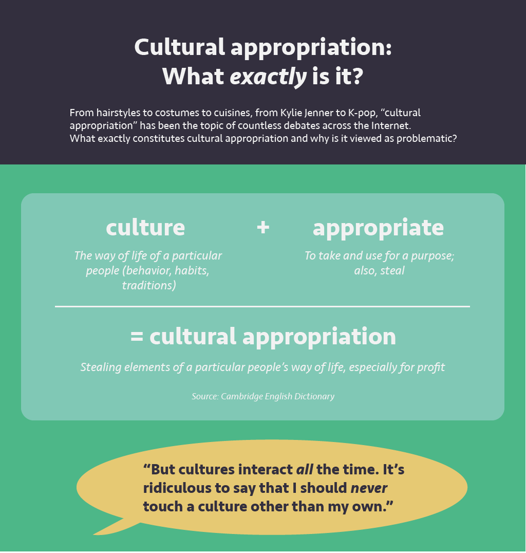
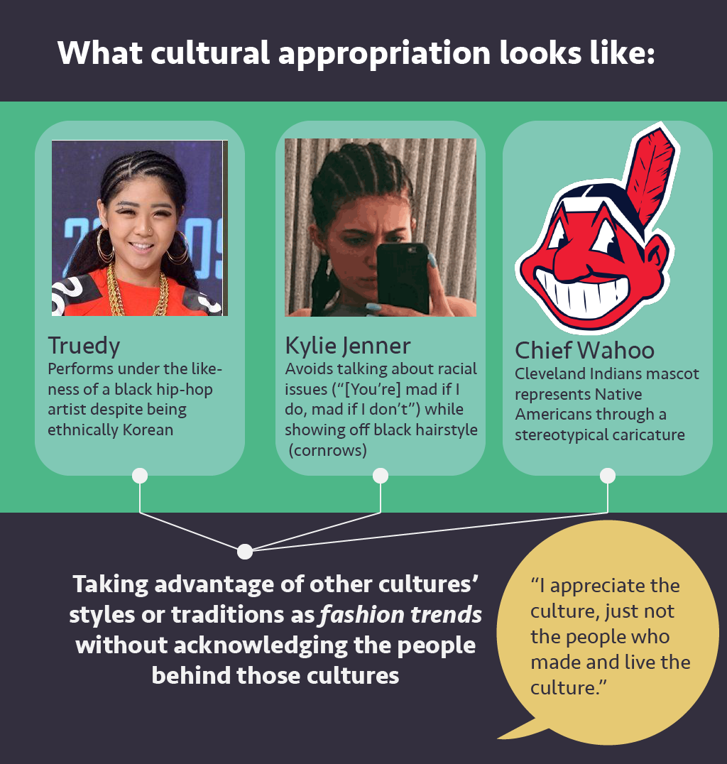
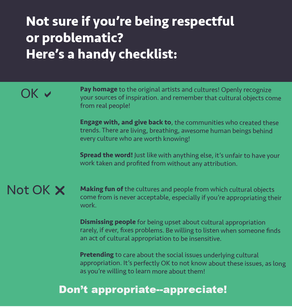
The titles of the three infographic cards were chosen by the key parts of the topic that needed the most clarification: what is cultural appropriation, what are some examples of it, and how to identify and respond to it.
One guiding principle for the design was to use visually striking text to summarize or emphasize important points. For instance, in the first card, I opted to use the equation "culture + appropration = cultural appropriation" to visually communicate that the topic boiled down to a simple sum of its parts.
Reflection
The main message of the infographic is that, intentional or not, cultural appropriation is an offensive behavior. I chose to highlight two potential (and common) counter-arguments to these positions in the form of yellow text bubbles, deliberately contrasted with the main content in green or off-black.
However, I do wish I had done a better job of visually indicating that I believe these positions are misinformed. By merely placing them at the end of the infographics, they don't do anything to support the main content; instead, they seem to directly contradict it with no clear explanation, which might confuse or communicate the opposite message to viewers.
Furthermore, something that is an essential part of most awareness campaigns which I neglected to integrate was a social media campaign. A symptom of my timidity on social media more than anything, the infographic didn't reach anyone beyond my Facebook friends. It's a long-term process, I'm sure, but I hope to one day overcome this shyness and gain the confidence to market my work.
Tools used
The infographic was made using Adobe Illustrator. Before drawing the infographic, I watched a few introduction to graphic design courses on Lynda.

What's next?
Hopefully more where that came from!
I had a fun time creating this infographic! It gave me valuable insight into the minds of a designer, an educator, and an informed citizen.
I'm always looking for ways to work on my graphic design skills, and I would love to create more infographics that clarify important social issues. I learned a ton about the importance of visual hierarchy and using contrast to communicate ideas—those principles always used to be intuitive to me, but only in terms of making information look pretty and not necessarily in the service of the user.
It's definitely not just a buzzword...
Knowing how to communicate social issues clearly and effectively often concerns me because of the ways in which undone emotions and preconceived notions can hinder constructive discussions of social justice. I am not exempt—I often find myself immediately looking down upon people who misunderstand the substance of issues such as cultural appropriation.
However, this project forced me to consider how and why someone who is not as involved in social justice would interpret the issue in the way they would. For instance, I knew, anecdotally, that people feel uneasy with denouncing problematic practices if they don't perceive viable alternatives to be available. By providing action items, I hoped to leave the reader feeling empowered and more conscious of what counter-appropriative actions looked like, as opposed to solely appropriative actions.
So yes, as it turned out, I took a lot of valuable lessons from this project in how to integrate empathy into design (and, ultimately, social justice).